NKPdesigns

Thursday, September 30, 2010

Same Form, Same Glaze, Same Clay, Different Firing Temperature

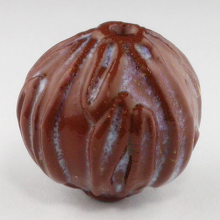
These beads are both formed from the same clay, (Toas Red Stoneware from Texas Pottery and Clay Co.), and the  same glaze (Speckled Pink A Dot from Mayco).

The difference is the firing temperature.  The brighter pink/red beads were in a cone 05 firing (approx. 1870 degrees F.) and the browner, more subtle pinks were in a  cone 02 (approx 2034 degree F) firing.

I am always a bit astonished at the differences in the stoneware clay bodies when it comes to color values in the firings.

Each bead is so different yet many aspects of their creation was exactly the same. 

Tuesday, September 28, 2010

Kiln Opening


This is my new manual Paragon kiln. It sits outside on my back porch beside my bigger kiln (for the bigger functional pottery). This promises to be a good workhorse of a kiln.

I put this batch in it yesterday around noon. When they finished, about 8 pm, I started my other small digital controlled Paragon kiln with a small batch of whistles (more about that in a separate post). Both kilns share the same outlet so they cannot be fired at the same time.


This is the view that I see when I open the kiln for the first time after a firing. It is when I am thrilled or exhale a disappointed sigh. I did both with this particular opening.

In this kiln I had a variety of porcelain, stoneware, and earthenware beads. The porcelain I had covered with a black underglaze which I wiped off before applying Mayco's Foundations "Light Blue". I had expected more of the underglaze to pop through the glaze, but it is more opaque than I thought it would be.   I do like these beads, however, I was going for a certain look. I will try again, but with a different shade of blue, hopefully one that is more transparent.

The earthenware beads were textured. I had also rubbed a black underglaze into the recesses. I covered with a new glaze (well, new for me anyway) "Victorian Red". The red of the earthenware clay simply deepened the red of the Victorian Red. It is not undesirable, but I did desire more of a contrast.

The round pink beads are an experiment with Speckled Pink a Dot on smooth earthenware. It's glazy and drippy, kinda gaudy, but in a good way.


This is how I pile the beads when they are still on their rods onto a plate to carry inside the house. Click through to see the photo bigger. 

This is not the greatest of lighting. It is on my kitchen counter sans a flash bulb with the settings on 'auto'. No, this plate is not used to eat from, just to carry beads from the kiln to the inside of the house. Removing the beads from the rods is just a matter of holding and pulling.

Sometimes a bit of the glaze runs onto the rod. Usually the bead can be twisted enough to break the hold. Sometimes too much of the glaze pulls off onto the rod and has to be discarded. Other times, the bead won't budge and has to be removed via wire cutters and discarded as well.


The nicest part in this firing was how the porcelain beads with stoneware sprigs turned out. I did this same technique with this as the earthenware and I love how they played nicely in the fire. Lots of contrast and texture.

The Victorian Red glaze glows off the porcelain and is transparent. It does not hinder the black underglaze which has settled nicely in the recesses.  The  stoneware sprig is blushing nicely with this particular shade of red. I am happy with this glaze, sprig, and texture clay combination.

Monday, September 27, 2010

In the Kiln ...

Today I have a variety of beads in the kiln, from whistles to a pendant, to textured beads with underglazes and overglazes. I'm excited to see how they turn out (if they turn out) the way I want them to.  The beads on the left are what came out of the kiln this morning. I am going to try to have something to showcase every day this week. 

This particular bead is a new design of mine. I have long been fascinated with silver beads and the many textural designs silver artists engineer.  I've been toying with the idea of attaching PMS clay to my ceramic clay but so far I have not.

I've been doing a lot of adding sprigs to beads lately, and I got to thinking about bead caps.  I've been thinking about pods, especially since its the fall and they seem to be everywhere.  I thought, "What would a pod look like if a pod had a bead cap?"  So this is what I came up with. Interesting?  I hope so!  I really liked making these and hope to make more.

Next time I will experiment with some underglazes. I'd like to find out what it will do in the recesses.   However, I have to get glazing for the load to put into tomorrow morning.  I'll try and remember to take a picture of the batch before they come out of the kiln. This morning I was so excited to see how these turned out, I completely forgot until the kiln was completely unloaded. I was ooohing and aahing, cooing and rolling them around in my hands. Suddenly I remembered, "OOPS!"

Tomorrow will be better.  Tomorrow is ALWAYS better!

Thursday, September 09, 2010

What I did Over Summer Vacation

The summer raced past.  I made a lot of whistles, beads, and pottery.  This morning I have spent the day organizing bead sets and deciding what to add to my bead store this next week.  Already on my to do list is another batch of 20 mm rounds to bisque fire, some odd shape beads to glaze, and at some point I have to go up to LMRA pottery studio and put my greenware on the correct shelf so it can be bisque fired.  Better yet, I need to go and load a bisque fire kiln over there and do my part.

Here is a mug I have finished and have not yet listed in my pottery store. I finished this over the summer. It is a red stoneware covered by a clear glaze -- that didn't go clear. It came out bright white!  I like the matte effect of the whole thing.

I thought it would be fun to add bright flowery decals for a final firing.  It's so Christmas-y, don't you think?

It is one of my favorite mugs, nice and big to hold hot chocolate in or a lot of coffee topped with cream and sugar.  Whipped cream should go on the top regardless of what it holds.

In any event, I'll eventually be adding it to the pottery store, once I get all the beads sorted out, the geology II test studied for, and the bizzilion other things that seem to need doing.  I can't believe I haven't written a blog article in over a month.  But it has been busy. I had two very fun custom orders over the summer.  One was to make mini neti pots, and the other mini cups, or should I say 'many' cups.  I have the cups uploaded over on Flickr, but as of yet have not added the mini neti pots. I'll do that now.  If you haven't yet seen these cute little mini cups, or if you are interested in seeing what I have been doing this summer, hop on over to Flickr. Click here for FLICKR PICS.

Wednesday, July 28, 2010

Obsessed with Clay Whistles

I've uploaded these whistles which I call "Bead Whistles" to my flickr page.  When you get there, you can click on each whistle to get a closer view.  These are all approx. 40  mm in length, and started off with a 20 mm ball of clay.

 Each whistle has its own voice.  Some can be blown with just a mild exhale of air, others require a definite puff, and most are somewhat in between, but all make sound.

These look great on a ribbon or a leather cord.  I have about 20 more that I'm currently glazing and hopefully will put in the kiln over the weekend.  We'll see.  Until then, enjoy looking at these.

Saturday, July 24, 2010

Glazed Clay Bead Whistles

I have been busy lately, and not just making these bead whistles. Late June, I participated in a workshop learning Apache Pottery. I worked with micaceous clay for the first time and helped build the bonfire which fired the pots we coiled. Early July, I sold lots and lots of pendants, beads, whistles, and other pottery at the Texas Pottery and Sculpture Guild's show. Mid-month there was a whirlwind trip to Santa Fe where we walked downtown peering into all the shops at wonderful Native American Indian pottery before paddling in kayaks down one of the rivers near Taos. The river was shallow and slow but it was a lot of fun.

By the time we returned home I was ready to relax with clay. I spent the next week creating small bead whistles. I formed 20 mm rounds, cut each in half, hollowed them out, put them back together, added the mouthpieces and the pieces needed to hang a cord through. Then I put in the holes needed to make a whistle sound. Last, I decorated each one with sprigs of clay which I textured to look like leafs and other things. I fired this batch to bisque temperature, then spent the next couple of days glazing.

Here is one of these small whistles which I took out of the small kiln yesterday morning. It is 42 mm from tip to tip with a width of 24 mm. The hole is 3 mm.

When I want to make a bigger whistle I form two small pinch pots and put them together.  But these extra small ones work best by hollowing a small bead of clay, hence the name 'bead whistles'.

Saturday, June 26, 2010

Art Bead Scene design challenge

The June design challenge at Art Bead Scene begins with this painting by Marcelle Lender Dancing the BoleroThe challenge is create an art bead using this painting as inspiration. However, I took inspiration from the colors in the painting to create a bracelet instead. 


First I pulled out some major colors from the painting and made this pallet in the lower right hand side of the painting.  Next I pulled out my vast collection of beads and set to work. The bright cherry tablets are a stretch as it wasn't in the pallet I have in the corner, but the brightest part of the skirt is that shade of pink.

Friday, June 25, 2010

Yay: Art Bead Scene

I woke up this morning to a fabulous email saying my NKP Beads (along with these other fabulous beauties) were being promoted at the Art Bead Scene Blog. Click on photo to visit the Art Bead Scene blog and to read Lorelei's Friday Finds article. I hope you are inspired to make something beady and fun. I know I am!

My cornflower blue beads are also in her Etsy treasury (picture above). Here's the link to Art Bead Scene and Lorelei's Etsy Treasury

Wednesday, June 23, 2010

Designer Interview: Fanciful Devices

When Fanciful Devices bought some beads from me, I was interested to see what sort of jewelry she designs so I clicked on over to her Etsy store to browse a bit.

I was fascinated with her jewelry. Many of the objects she uses are found objects from antiques, not average design elements. I was intrigued and asked her for an interview. I was happy when she agreed.

When did you first realize you were an artist?
Oh, no, that's an impossible question. I struggle with the word "artist" because it's been so tainted in my mind with... oh, I don't know, self-important people with manifestos and all that. But I've always seen the world aesthetically.


How did you become interested in making jewelry?
The blogging craft world was a huge inspiration. I like too many different kinds of media and styles when it comes to "real" on-the-wall art to be able to find my own voice or niche in that - painting, drawing, lots of collage, even lots of scrap booking. I couldn't quite find my thing.: Then, a bit over 2 years ago, I was going to visit my family in South America for the first time in over 10 years. It occurred to me to make jewelry for my 5 girl cousins and 2 boy cousin's girlfriends. I went a little crazy. I think in the end each cousin got 3 or 4 pieces. Since then I haven't stopped.

You seem to have a flair for the steam punk theme. What drew you to become interested in this genre?
Recently, my little sister visited. She saw a pile of my jewelry stuff and said, "You're really going with the 'old' thing, huh?" Cracked me up.

I don't know what it is, but, I love things that look old, and things that are made from elements that weren't intended for adornment. Maybe it makes a piece look mysterious, like it has an unknown function. In any case, if it's small enough and old, watch out cuz I'll connect it to a necklace somehow. Plus whenever I'm surprised and amazed by another jewelry maker's work, it's usually because it has an unexpected element that I hadn't before seen incorporated into jewelry. A huge part of my first year or so on Etsy involved me going- look at this necklace with reused pearls! Why didn't I think of pearls?! And stuff like that. Now I look at every piece of garbage on the ground for my next great break-through incorporation...


I noticed you have an unusual eyeball in this necklace ... where and how did you find such an interesting element?
Well, a few months ago, I returned to my country of origin, Uruguay, and just amassed as much stuff as I could. That actual eyeball was from a bead store I just stumbled upon. It was all Chinese imports. Everything in there was so cute! Now I wish I'd gotten much more. In any case, I'm always on the look out. My husband teases me because I'll pick up a piece of rusted trash on the street and apparently get this faraway look. He goes, "Uh-oh. She's thinking what she can make with it."


In several of your listings, you reference such interesting writers ... I loved the writing in this particular sold listing.  I did a search on "Russell Edson" and found a collection of his prose online. I especially liked this "Steam Monkey" and "The Fall". How did you run across him?

In college! A housemate once cracked open a book of his that she had and started reading out loud. I was hooked. The book was also full of his line drawings- I wish I remembered the title. In a poetry class I took later, we were all to introduce the class to a poet and I chose him. One student with this gravely voice read a poem out loud that had us all rolling on the ground. And it turned out my professor knew Edson personally. I'm so glad that caught your eye.


On your Blog, you've come out as being staunchly opposed to cutesy, do you see yourself eventually turning this direction?
Hm. Interesting question. I am a girl, after all, so I can't help but be attracted to ruffly, glittery things. It's funny, but I've had this discussion with other art/craft/bloggers. On one hand, 'pretty' is catchy and easy and since there's so much cutesy supplies out there, it's so tempting. On the other hand, we have a knee-jerk reaction against it as not being serious or deep somehow, or as simply being over-done. Sometimes, though, the knee-jerk reaction against something is just as bad. Pretty in itself isn't intrinsically wrong, and it is jewelry after all, it's not meant to be ugly. So I indulge myself in what I call my 'country' pieces. these are my necklaces made out of shabby little toys and miniatures. They haven't been big sellers for me, however. I can see why someone might be willing to pay $20 for a cheap cutesy piece made en masse, but not $40 for a ooak. I get that.


In this listing, you have some little known facts about insane asylums and where they originated. How do you find such interesting descriptions and are they the inspiration for your earrings or visa-versa? 

My 'descriptions' only develop when I've already finished the piece, taken and edited my photos, and am in the middle of posting, wondering what the heck interesting thing I can say. I'll let the piece take me on a stream of consciousness trip somewhere, then look up the whatever I land on... Once I just thought "early psychology!" and looked it up. the origins of things we take for granted are always so amazing and evocative to me. So many things originated in ancient Arabic culture-- science, math, medicine, universities, libraries, etc, etc. It's something totally undervalued or overlooked in our societies' world-view or our western awareness. Because it was all during the dark ages in Europe when these disciplines were flourishing in the middle east. It's fascinating. But, in any case, I think of something interesting, read about it online, edit it down to the most evocative tidbits, and there you are.  Unlike my jewelry making, though, I burn out and run out of inspiration sometimes and just don't know what to put. That's when I start quoting poetry.


What direction do you see yourself taking as a jewelry designer in the next few years?
I've never thought about it! Wow. I'm so wrapped up in the absolute ecstasy of making stuff, it never occurred to me to think of going in any direction.  I have very few expenses other than supplies. I don't spend money because I never go anywhere because I'd always rather be making. My husband is very patient.

It would be nice to get handy with the networking media and all. I never even had a blog before my wonderful friend and inspiration Sparrow Salvage encouraged me to. I wish someone would hold my hand through learning to twitter (I have a phone phobia), getting used to facebook, and even going out to the craft fairs. I tend to wanna just stay home making stuff.


You have such a fun store name. How did you come up with Fanciful Devices?
The name was one detail in my whole vision when I started the store.  I realized every part could be an opportunity for expression- the title, description. that's my shtick I guess, my marketing. Since all I have is the listing and not a cool-ambiance boutique to provide that part of the shopping experience.

 I realized that the shops that I was more intrigued by had a whole aura about them, an aura of artistry and evocativeness that was reflected wherever possible- in the photos, descriptions, shop announcement, avatar, and not just the items for sale. This was all part of the experience for the buyer. But besides this being good marketing, capturing the imagination of a shopper, it's also another avenue for expression. I can have as much fun making a interesting description as I can making earrings and such. Well, almost.


Grab a cup of coffee or tea and browse Fanciful Devices' Etsy store .  Oh, check out her blog too.

Friday, June 18, 2010

Same Glaze, different clay

In a post earlier this week I shared a clear Cone 1 Once Fire glaze recipe. I wanted to also share my results of adding about 2 grams of light rutile to the mix.  This first picture is a sprig bead that is made out of Red Toas Stoneware clay from Texas Pottery. It matures at cone 5. I fired this clay to cone 1.  Notice how the rutile turned lavender and pooled nicely around the sprigs.

Here is the same glaze, applied the same way, and fired to the same temperature.  These are tablet beads which I imprinted with a flower stamp I created from a vintage button.  The clay is Frost and it also matures at cone 5.  Here there is not a hint of lavender, but it did give it this slightly lovely yellow cast where the glaze settled.  Any glaze chemistry experts reading this who know why I got such different results? I would love to know why. I am guessing that perhaps the lavender is of such an insignificant amount that it cannot be seen against the whiteness of the clay. Any ideas?

Thursday, June 17, 2010

Designer Interview: Rustique Art

Cindi is the owner of a Christian based company featuring crosses as gifts, home accents, accessories and jewelery. Each design is handcrafted from start to finish, beginning with the wire that is used to make the cross form, adding any paint or finishes to the cross before hand sewing the beads on with wire.

I first met Cindi several years ago when she bought some beads from me at a show. Since then she has continued to incorporate my handmade daisy porcelain and stoneware beads into her designs.  She also incorporats the art of wire sculpting and wrapping with beautiful gemstones, glass, crystal, metal beads, vintage jewelry and an occasional piece of discarded treasure. Thus, a wall cross of heirloom quality is designed and created.  I have asked Cindi to tell us a bit about herself.   

Cindi, did you always know you were an artist?   Funny...I don't consider myself an artist, but a designer.  Is that the same...I wonder.  I have always enjoyed making things, using my hands, designing, dreaming and yearning for the talent of a artist. 


I definitely think designers and artists are cut from the same cloth.  Plus, there is no doubt in our minds that you are an artist, very talented and creative. What inspires you? Where do your ideas come from? I am inspired by many things. People inspire me through their writing and photography. The Bible inspires me for obvious reasons. Music can even inspire me on certain days. My ideas come from the same places, nature plays a huge role as I will often use colors from nature when designing a cross. Many times a pictorial in a magazine gives me a beginning to my designs.


No wonder so many are drawn to your crosses.  What materials do you enjoy working with the most and why? Wire and beads. Wire because it is so functional. You can bend it, shape it and make any shape you want. Beads because they are to me what oils are to an artist with a blank canvas. So you could say that the wire, once formed is my canvas and the beads are my paint. Gemstones, rocks, ceramic, clay, metal, glass, wood, bone...my only rule is no plastic beads. Texture, shape and luster play a big role in my bead selections. I am very picky.


I think all artists are picky and that's a good thing.  What do you find the most rewarding about being an artist? That is changing daily. But I've always desired my designs to glorify God. The finished design is very rewarding, especially if I think that I have captured the inspiration that the design was based on.

Please describe what are you currently working on. Right now I'm in the midst of transition...not working on any particular design, just playing with some ideas. I have a couple of crosses almost completed and many ideas floating around in my head.

Do you work in other mediums? I will sometimes use paint in my designs...I've used leather, feathers. I do work with steel crosses and wrap those with beads.


Can you share any words of wisdom for a beginning artist? Do what you love to do. Don't try to copy someone else, even though you might love their work, it's theirs and they created it....maybe that's what draws you to it. But it won't be the same if you try to make what they have made. Don't create for other people, create for you. In other words don't try to make what you think others will like. Just do what you love to do and allow the creative energy to flow. If you are a artist with a background of faith...I encourage you to pray about each thing you make. Don't be afraid to try new techniques and experiment a lot. Many will flop, but many other ideas can come out of a mistake or failure. Always be aware of how much time you are devoting to your art....I believe God and family comes first.

Most definitely!  Thanks Cindi!

To order custom designs visit Cindi's website website (www.rustiqueart.com) and to buy finished designs visit her here:  www.rustiqueart.etsy.com.

To view more of Cindi's designs, check out her Flickr page.

For fun and networking: Join her Facebook Fanpage .  Follow her on Twitter as well.

She also blogs too! Business and task oriented: www.rustiqueartblog.com and personal reflections: www.rustiqueart.blogspot.com.

Tuesday, June 15, 2010

Glaze Making ...

I have a glaze recipe that I worked with at the college lab a semester or two ago. It is a once fire recipe that goes to Cone 1, clear glossy.   I made up a small batch of that today for some sprig beads that I will be firing tomorrow.  Right now I'm waiting for some mugs to dry so I can bisque fire them in the big kiln. The beads, however, will be fired in the smaller kiln.

The first thing when mixing glazes is to always always wear a mask. Here's a disposable mask (N95) that works quite well. I use this type for mixing up small batches (scroll down).

The next thing I use is a gram scale, which I bought at a local ceramic's company. It also measures in ounces as well as something called 'n'. I keep thinking I ought to google that someday... someday.

Glaze recipes are written out in grams. The great thing about that is that if you want a big batch, just add a zero to the end. I was confused about the process of glaze recipes for a long time. For example, when cooking first the garlic and onions are sauteed, the meat added, some spices ... allow time to cook ... add veggies, perhaps some more spices ...allow time to cook ... etc ....

With glaze recipes, you just dump it all together, stir it up, and add in the colorants and water last ... or you can dump it into a small amount of water and add more water later. It is no wonder when looking at glaze recipes I was so confused. I was looking for "add this, stir, add that, let sit ...."   That sort of thing doesn't happen with glazes. Okay ... enough laughing. I do tend to over think some things. ha ha!

In any event, today I mixed up a cone 1 glaze.  Here's the recipe ...


CLEAR GLOSS, Cone 1, Once Fire
feldspar 3134: 61.0
kaolin : 20.5
ball clay : 18.5
add cmc : (1/2 tsp)

Feldspar is mineral composed largely of a linked chain of silica, aluminum, and oxygen elements. Along with quartz, it is the most common mineral on the continents. The word means "field crystal." It is ground up crystal that melts nicely. Kaolin is a white clay, very pure, used in porcelain and ball clay is a type of clay that is very plastic and pliable. It, along with the kaolin, will help the melted feldspar fit the clay. The CMC thickens the glaze so that I can apply it with a brush.

I could add colorants at this point, like rutile or cobalt/copper carbonate and perhaps I will end up doing that later, but right now I'm just after a nice clear glaze to coat some of the white porcelain sprig beads like the one at the beginning of this post. These will be fired at a higher temperature but the look will be about the same.

Wednesday, June 02, 2010

My Camera

My father has done much to encourage me in my art endeavors.  He bought me my first pottery wheel and my kiln. Really ....does it get better than that?  Yes, it does!  He also taught me how to string beads using wire and crimp beads, which led to me making ceramic beads. He passed on his incredible camera when he bought a new one. The list goes on and on .... 

During his visit a couple of weeks ago he brought some beautiful cactus photos with him and explained in detail the steps he uses to make them really pop out.  I have never used the 'sharpen' feature of Picasa, or any other of them for that matter, but he patiently went through photo after photo, demonstrating which function to use and how much to slide it to the left or the right.  At first I didn't see much difference.  Then, I started to understand.  By the time he finished, I had a much better understanding of how Picasa worked in general.  You can make a small change and not see much of a difference, but if you do about 4 or 5 small things, then undo them to look at the original photo, there is a huge difference. 

The camera my father gave me is a Nikon Coolpix 4500.  The best thing about this camera is that the camera lens can swivel and it is easy to capture any angle, which makes for great perspectives especially with the macro feature.  To my untrained eyes, the photos always looked sharp enough.  However, after he demonstrated on some of his own photos, moving that sharpen slider over to the right makes a wow difference.

I also tried the glow option for brightness.   The glow option is about equal to the brighten option in PaintShop Pro.  The problem with the glow is that it also gives the photos an intensity that they do not possess, but lowering the saturation tones that back to normal.  The added bonus is that with the lighting setup (see previous blog article), I don't seem to need the contrast option I previously used in Gimp.  The goal is to have an accurate photo which is pleasing to the eye.

Cropping is the last thing I do before exporting (copying) the pictures to a file folder to be uploaded to either Flickr or an Etsy listing.  Cropping pictures to be used on Etsy is an art all to itself.  The site advises a photo of about 1000 pixels wide.

However, if the object this is being photographed has equal negative space on all four sides, it won't show well in the gallery view.  There has to be more negative space on the top and the bottom than on the sides.  Therefore, the image has to be in the middle. This goes against the first rule of photography that anything can be in the middle. However, if you think about it, offseting the image to one side (left or right), and/or using the negative space in thirds (less on top and bottom than in the middle) will still allow for the basic rules to be followed.


I will not say my photos are up to the level of a professional photographer, but they are better than they were a couple of weeks ago and I'm grateful for that.  THANKS DAD!  THANKS ETSY TEAMS!

I'm hoping that if someone else is struggling that these tips will help a bit, and if you have conquered your photo taking/processing skills and have more to share (or correct), please do.  Thanks!

Tuesday, June 01, 2010

Lighting Lighting Lighting

This is my current lighting setup.  Two hardware lights and a lamp, all equipped with sunlight bulbs.  I covered the openings of the two hardware lamps with photocopier paper (two sheets per lamp) and taped two sheets around the lamp to diffuse the light and eliminate glare spots.

I laid more photocopier paper on the bottom.  That is what the beads will sit upon as they are being photographed. For pottery I will move the lamps slightly back and use graduated background paper I recently purchased from B&H Photo..

This is probably about as inexpensive as it can get.  I have struggled with lighting and photography for as long as I have had my two Etsy stores.  I think taking pictures it is just as hard (or harder) than creating beads and pottery.

That's where being a member of a team on Etsy is so amazing.  I am a member of two teams, The Etsy Mud Team and the Beads Of Clay team.  All the members are incredibly helpful.   Most have photography down to a fine art and are extremely willing to look at other's setups and make helpful suggestions.  The mentoring is fantastic! They have helped me through some really bad photo setups. Looking through my first sales in my shops, it is easy to see where I started.  It's difficult to train the eye as to what is a good photo from a bad photo when you are not sure what a good photo is supposed to look like.  I have been looking in design magazines to get a better idea and I have realized that the photos I've taken the last couple of years are nice and bright, but the lighting is harsh and glaring.  The goal is to take a picture that accurately represents the item, but make it pleasing to the eye.  That leads to lots of questions.  Is it better to take photos inside or outside?  How much lighting is too much and how little is too little?  How should a shot be framed/cropped?  How important is perspective?  What is a good graphic's program? What is a good camera?  Flash? No flash?  First things first: lighting.

For myself, I have had to decide whether or not I want to take photos inside or outside.  I would prefer to take photos outside, but it can be cloudy for days on end in the winter. In the summer, I don't have proper shade.  It would take just as long to set up and take down outside as it would inside.  Plus, I seem to have the same problem with glare outside as I do inside (Example: Third photo on my blog post here). 


And after the picture is taken, it must be processed. In the past, I have utilized many programs for processing the photos.  I have a very old edition of Paintshop Pro.  I have installed Gimp (freeware) as well as Picasa (freeware). For a while I was importing the photos with Picasa, processing the cropping and brightness with Paintshop Pro, then adjusting the contrast with Gimp.  Currently I'm using Picasa exclusively.  My next article will be about that.